Fact Based Decision Making – Focus on the Vital Few
If you collect data on many variables over any length of time, you may find yourself in the position of drowning in data and starving for information. As a manager and leader, you need to focus on the key data elements that will most directly affect your decision making. You may know already that the vital, few pieces of data include sales performance, number of complaints, increased market share, or assembly downtime, or you may not be sure which of the myriad bits of data really are vital. You or your staff can use statistical and information visualization techniques to isolate key findings and correlate or cluster data into meaningful pieces. Your selection criteria for the “vital few” should be driven by strategic objectives. You do not want to get too far down in the weeds of the data detail. Once you have pulled data on key indicators, your task is to select the top few, say three to five data points, and then pursue improvement of your organization’s performance on those tasks. This reflects your commitment to continual improvement. After identifying the vital few and developing objectives for future performance, work with your staff to develop tactics to reach your objectives. You need to be personally involved in monitoring performance on the vital few measures, and you need to be sure that your interest is being communicated throughout the organization.
Visually Display Data
Organizations use data to understand where they are, what is happening, and what may happen. Data helps measure progress and identify problems. Data can be boring, but it doesn’t have to be. Presenting data using visual representations rather than just text or columns of numbers is less boring and can communicate decision-impacting information faster. Visual representations add a dimension to the data that allows the viewer to quickly grab trends and patterns (people are more distracted than ever), and it is the understanding of trends and patterns that facilitates effective actions. There are several data visualization software products on the market, here a couple for you to review:
a. Qlikview: Qlik® lets you create visualizations, dashboards, and apps that answer your company’s most important questions. Now you can see the whole story that lives within your data. Here is a Qlikview case study:
b. Tableau: Tableau helps the world’s largest organizations unleash the power of their most valuable assets: their data and their people.
Presenting data visually lets you represent relationships over time, geography, and among or between groups. Well-done visualizations will make your point quickly and intuitively to your viewers, and your viewers will remember the drawn conclusions better when they can carry that visual summary around in their heads.
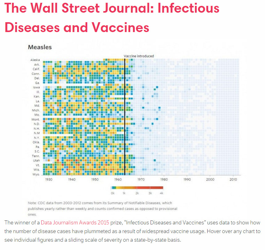
Using visualization also makes patterns apparent that might otherwise be hidden. Here is a set of examples (click here or on image to visit the original Scribble Live article):
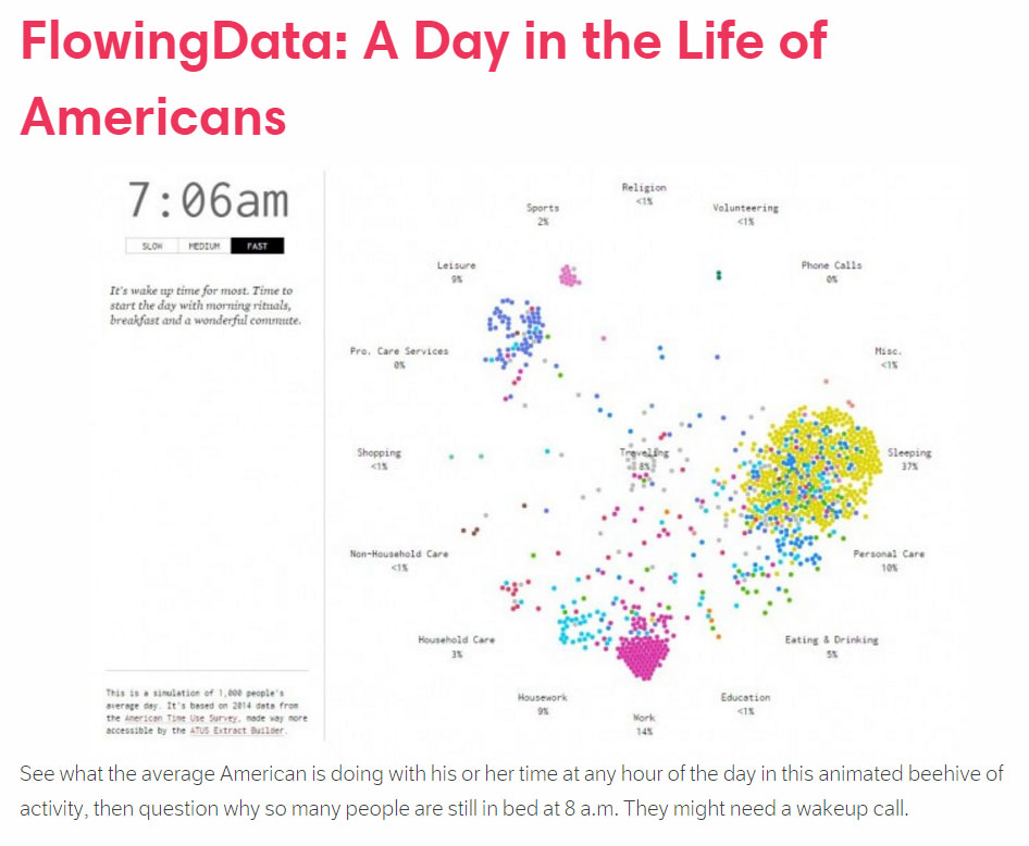
 Source: http://www.scribblelive.com