Looking for Trends
Looking for trends is part of data analysis. If you look at your data and see something seriously harming your bottom line or an opportunity that needs to be grabbed immediately—you take action. Trends are subtler than data points you jump on right away. Trends are slight directional changes over time or correlations among different data categories collected simultaneously. Finding trends and making a proactive response allows you to avoid situations that require emergency, all-out action.
Data-Driven Trend Analysis
One approach to trend analysis is statistical. By applying algorithms to data, you can see if your performance reflects normal process variation or if there is a real trend in the direction of the data. For example, how do you know if last month’s system errors were typical or higher than normal? By looking at your average error rates, you see the error rate is pretty close to average, within one, standard deviation of the mean—certainly not elevated enough to cause you to do something different. If you want to practice continual improvement by lowering your errors per month, you might choose to compare each future month against your benchmark, or you can create a trend line and measure its slope over time to see if the direction is the desired one, even if the value differences are not statistically significant. Finally, you can plot just the changes in the average or mean. Any of these techniques will give you a window into trends in your organization’s performance.
Intuitive Trend Analysis
Another approach to trend analysis is intuitive. Instead of using numeric data, intuitive trend analysis relies on knowledge gained on the job or in the world. Intuitive trend analysis is a sense of what is normal or a feeling that something is unusual. Intuitive trend analysis shouldn’t be shunned because it seems less scientific than a data-driven approach. Business leaders, famous investors, inventors, researchers, and other professionals often rely on intuition-based trend analysis. Daniel Isenberg, senior lecturer of business administration at the Harvard Business School in the Entrepreneurial Management Unit, tells us from his research on intuition30 that senior managers and leaders use intuition to identify when a problem exists, to synthesize isolated bits of data and experience into an integrated picture—sometimes called an “aha” moment, as a check on the output of “rational” or data-driven analysis and when the need to move quickly forestalls formal data collection and analysis. Intuitive identification of a trend can also provide the impetus to collect confirming data. In a classic case of intuitive trend analysis, Winn Schwartau, author of Information Warfare, relates a story about how just prior to the first Gulf War, a foreign government could have deduced an imminent military action: “We knew the night before the Gulf War because of all the pizza orders heading to the Pentagon” Schwartau deduced, using the number of people working late based on cars in the Pentagon parking lot and the number of delivered pizzas as indicators, something unusual was going on.
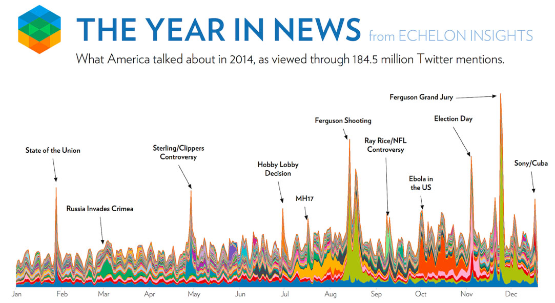
Tips for Presenting your Data Trends Analysis
1. Minimize the extras. Eliminate data that is not directly supporting your case. You can always provide more details if needed.
2. Rainbow of colors. Minimize the number of colors, pick color that you will use consistently to emphasize your main points.
3. CYA. Consider your audience. Remove jargon and acronyms that aren’t part of your audience’s day-to-day vernacular.
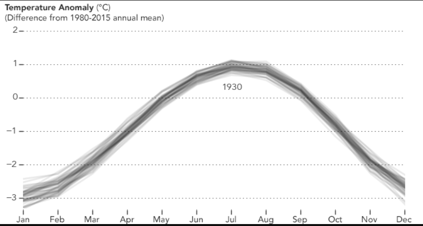
4. Jam packed. Don’t try to share all the data on one screen. Leave some whitespace, make your main points jump off the screen. This GIF below shows (click to run GIF) monthly weather trend data starting in 1880. Found on Reddit, highly recommend reddit.com/r/dataisbeautiful community.
5. What’s the story? Tell your audience a story through the data. Especially in a business setting, leverage the power of data to support your narrative.
Good article from the Harvard Business Review – How to Tell a Story with Data
Humans have a powerful capacity to process visual information, skills that date far back in our evolutionary lineage. And since the advent of science, we have employed intricate visual strategies to communicate data, often utilizing design principles that draw on these basic cognitive skills. In a modern world where we have far more data than we can process, the practice of data visualization has gained even more importance. From scientific visualization to pop infographics, designers are increasingly tasked with incorporating data into the media experience. Data has emerged as such a critical part of modern life that it has entered into the realm of art, where data-driven visual experiences challenge viewers to find personal meaning from a sea of information, a task that is increasingly present in every aspect of our information-infused lives.
Featuring:
Edward Tufte, Yale University
Julie Steele, O’Reilly Media
Josh Smith, Hyperakt
Jer Thorp, Office for Creative Research
Office of Creative Research:
“Gate Change” by Ben Rubin w/ Mark Hansen & Jer Thorp
“And That’s The Way It Is” by Ben Rubin w/ Mark Hansen & Jer Thorp
“Shakespeare Machine” by Ben Rubin w/ Mark Hansen & Jer Thorp
“Moveable Type” by Ben Rubin & Mark Hansen
“Listening Post” by Ben Rubin & Mark Hansen